Sour Flower
Branding

After working on Chasing Flowers’ branding, I was contacted by a friend of hers to do the same for her own business. The aim of this branding was similar: to create an identity that reflected the client’s personality and approach to floristry.
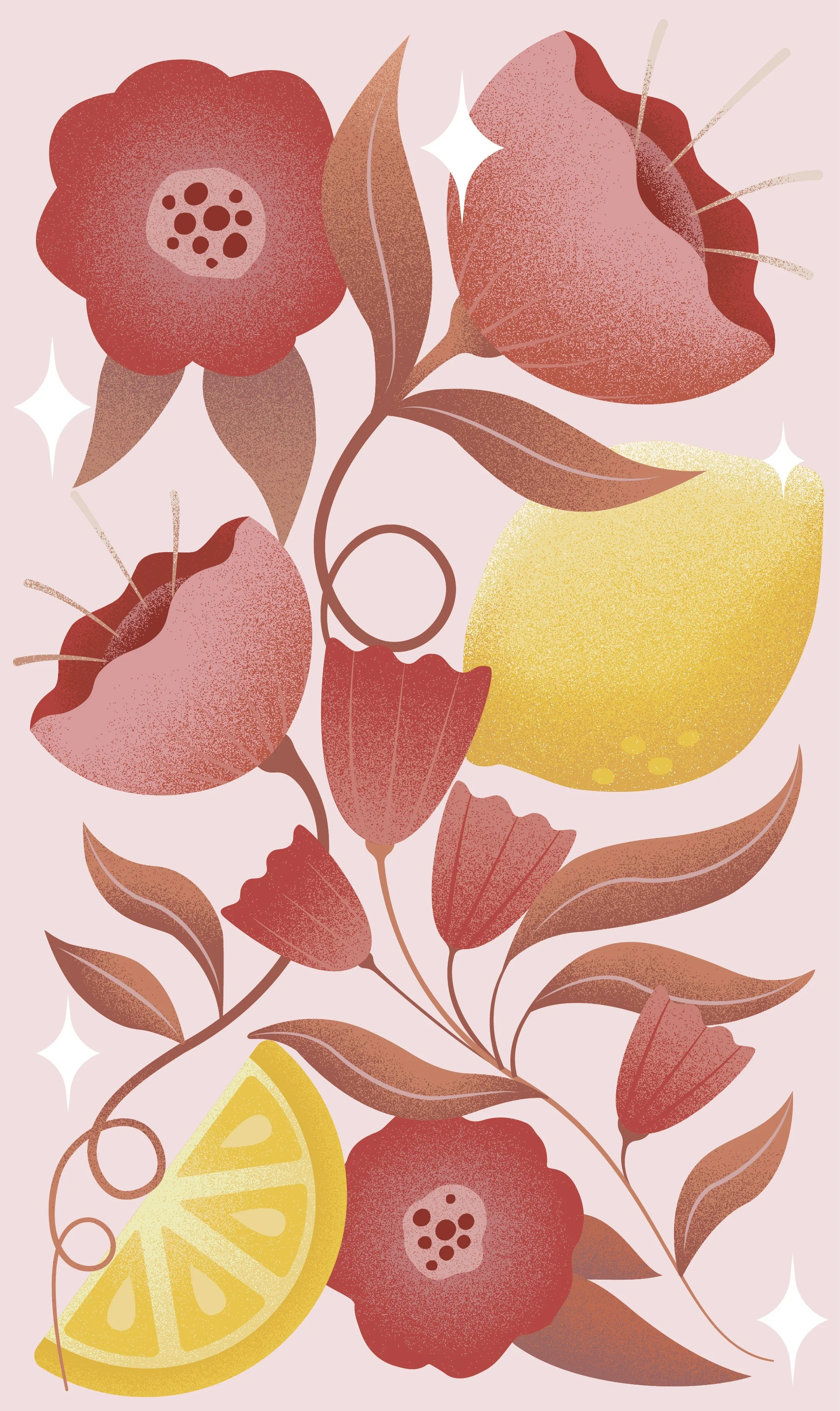
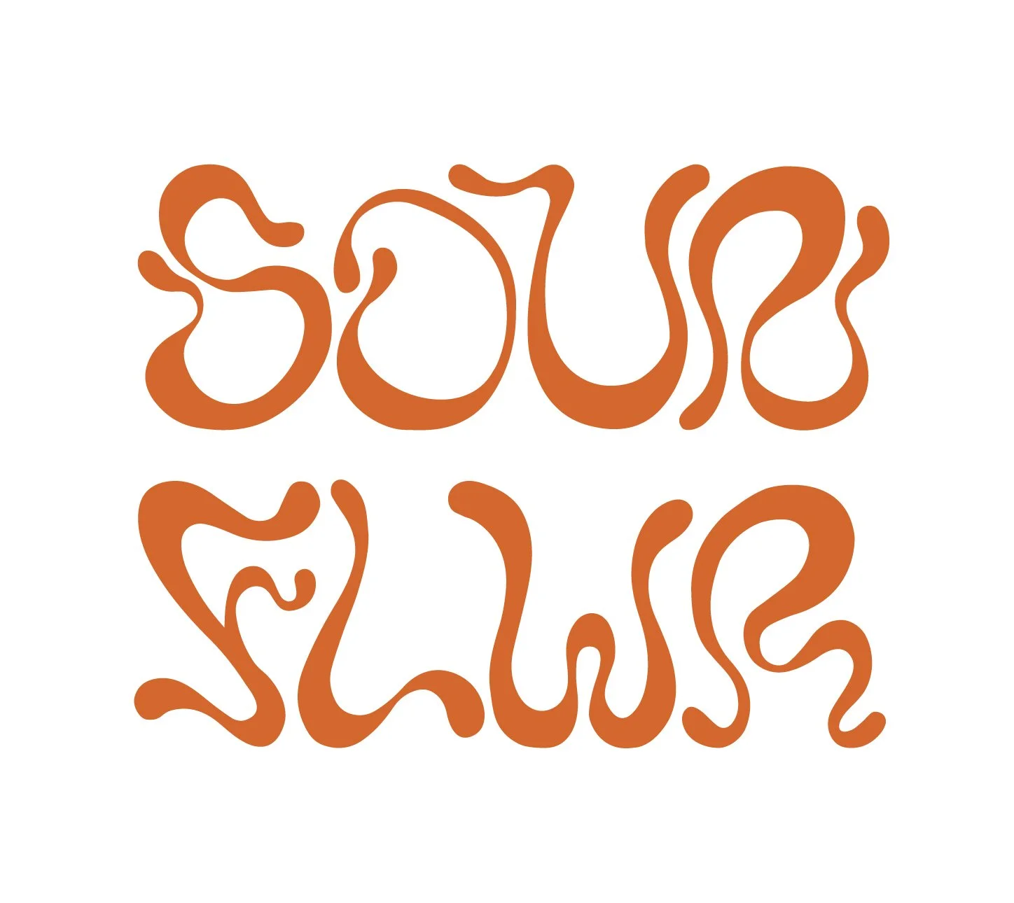
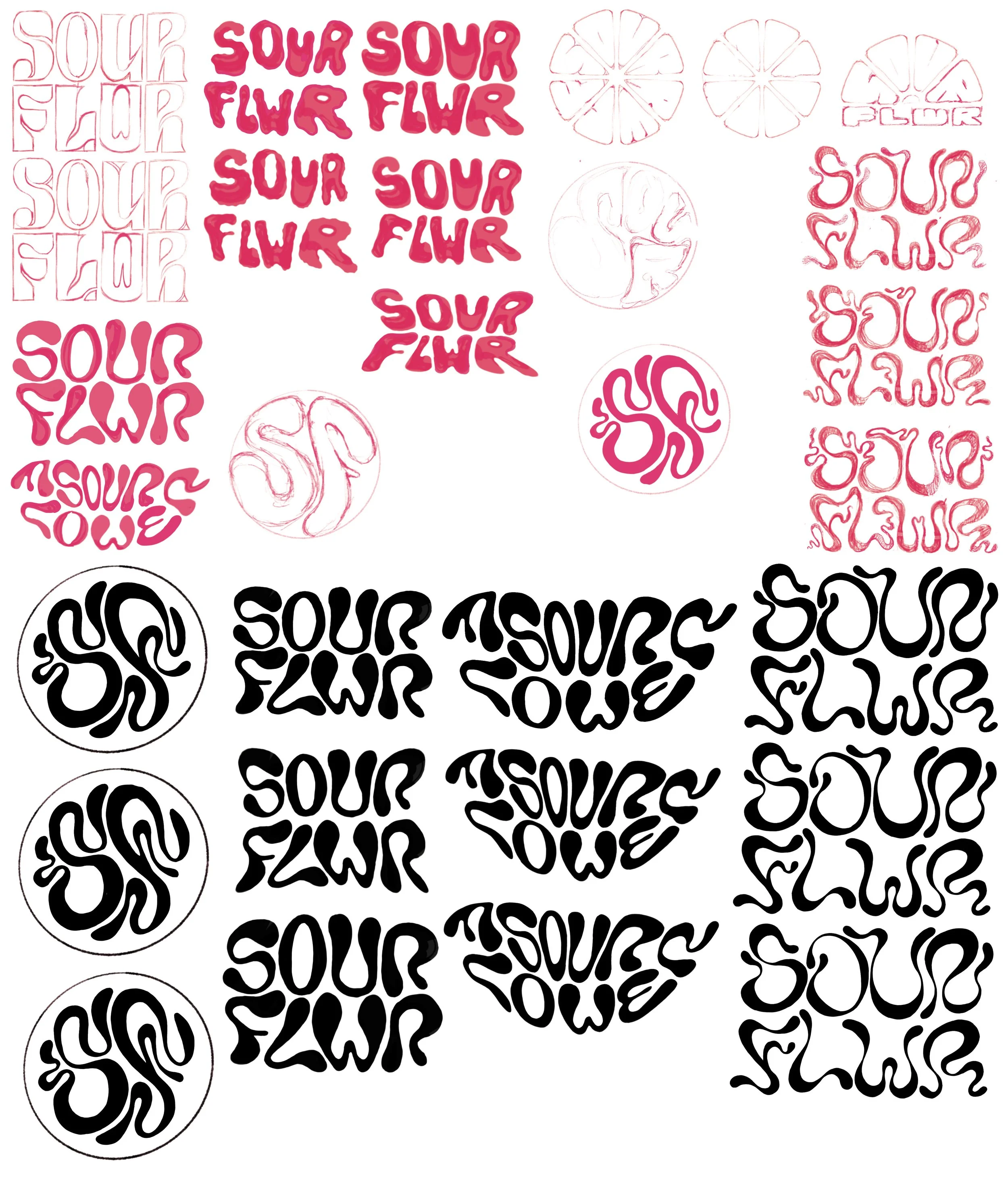
The client provided a straightforward brief to create three key brand assets: a business card backing, a logo, and a logotype. The design direction was guided by the keywords fresh, sour, and sophisticated. The client also requested an illustration with a subtle grain texture that remained vector-based, allowing it to be easily scaled and adapted for a range of branding applications.