Tawns Tea
Packaging
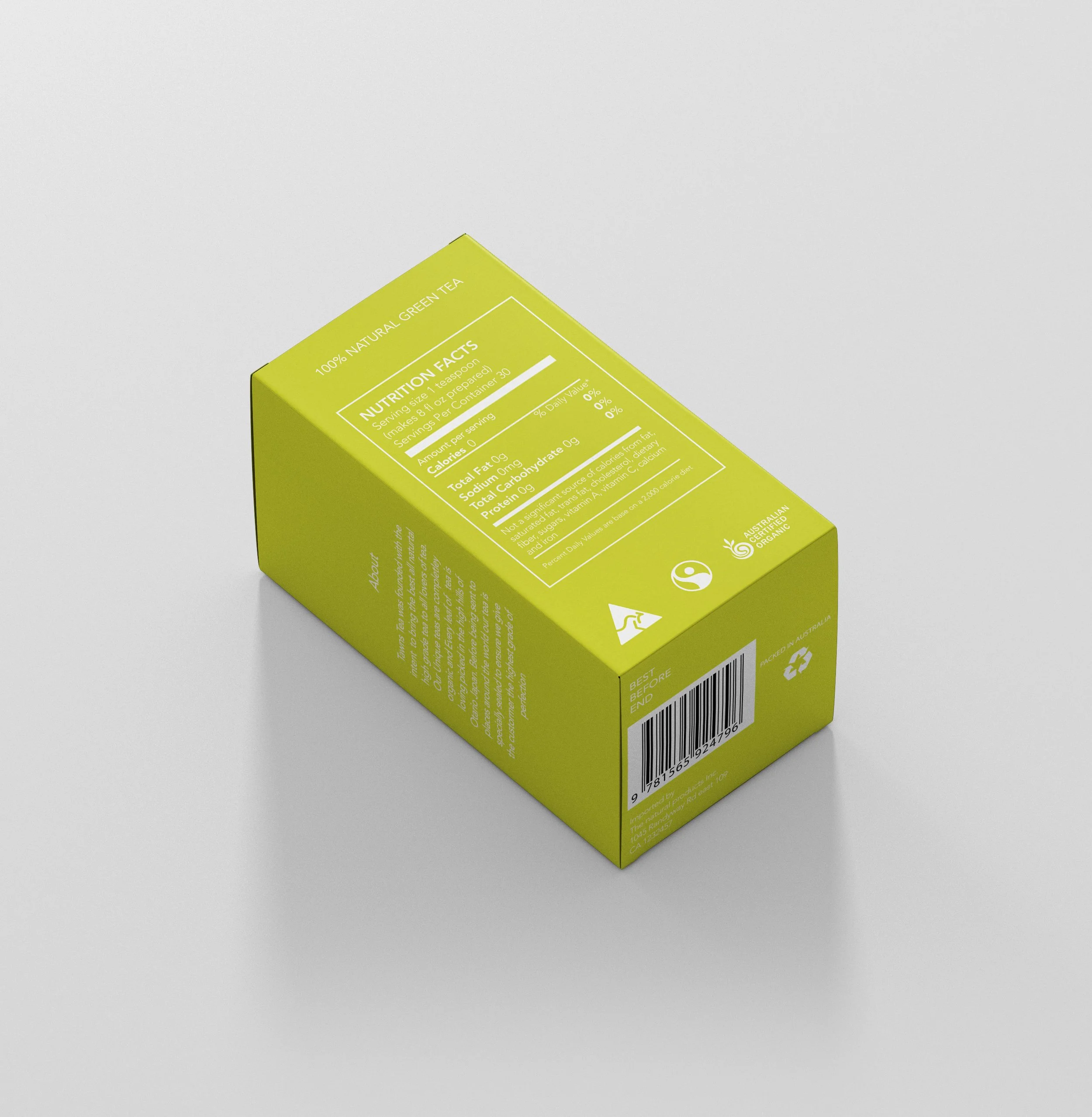
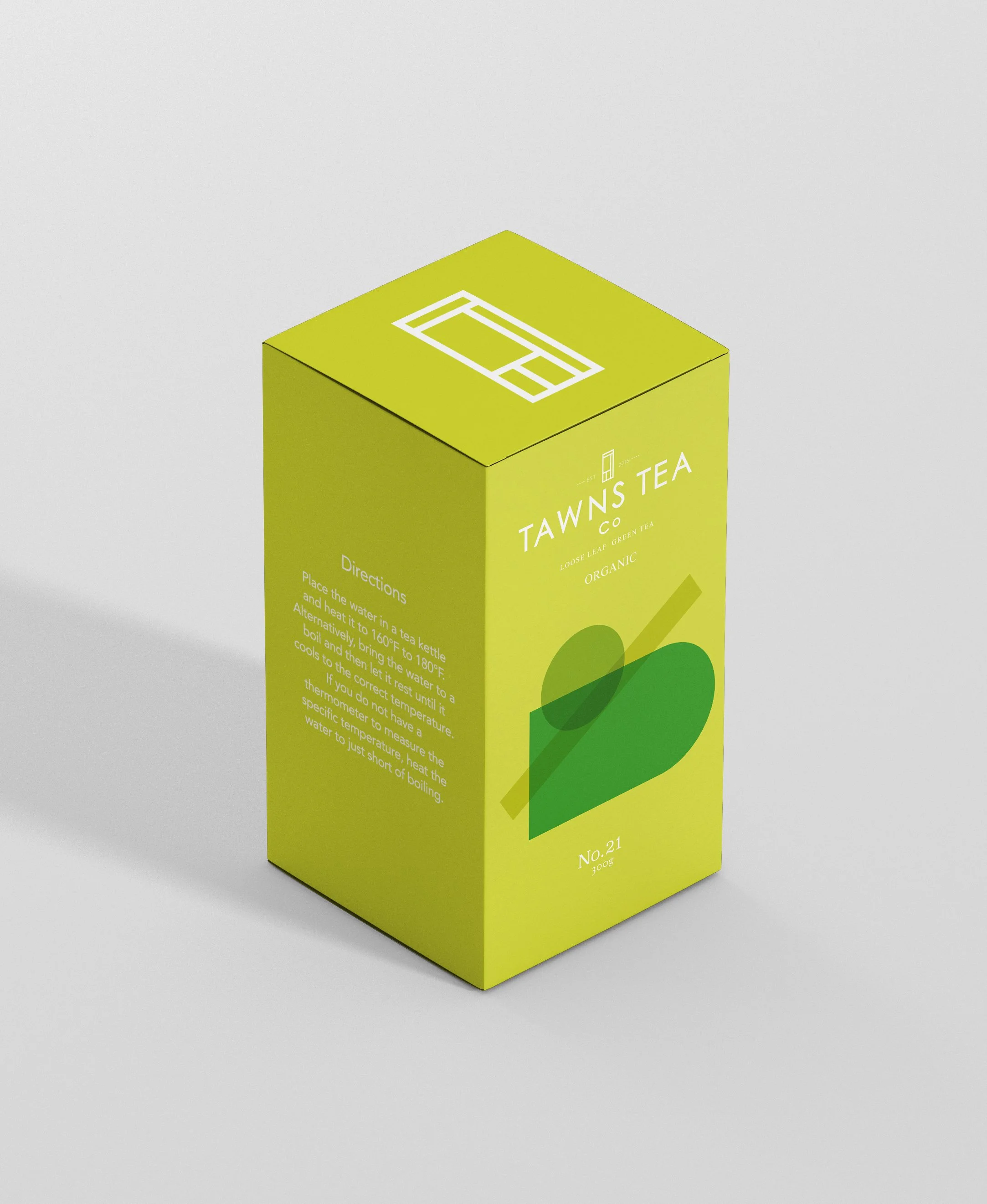
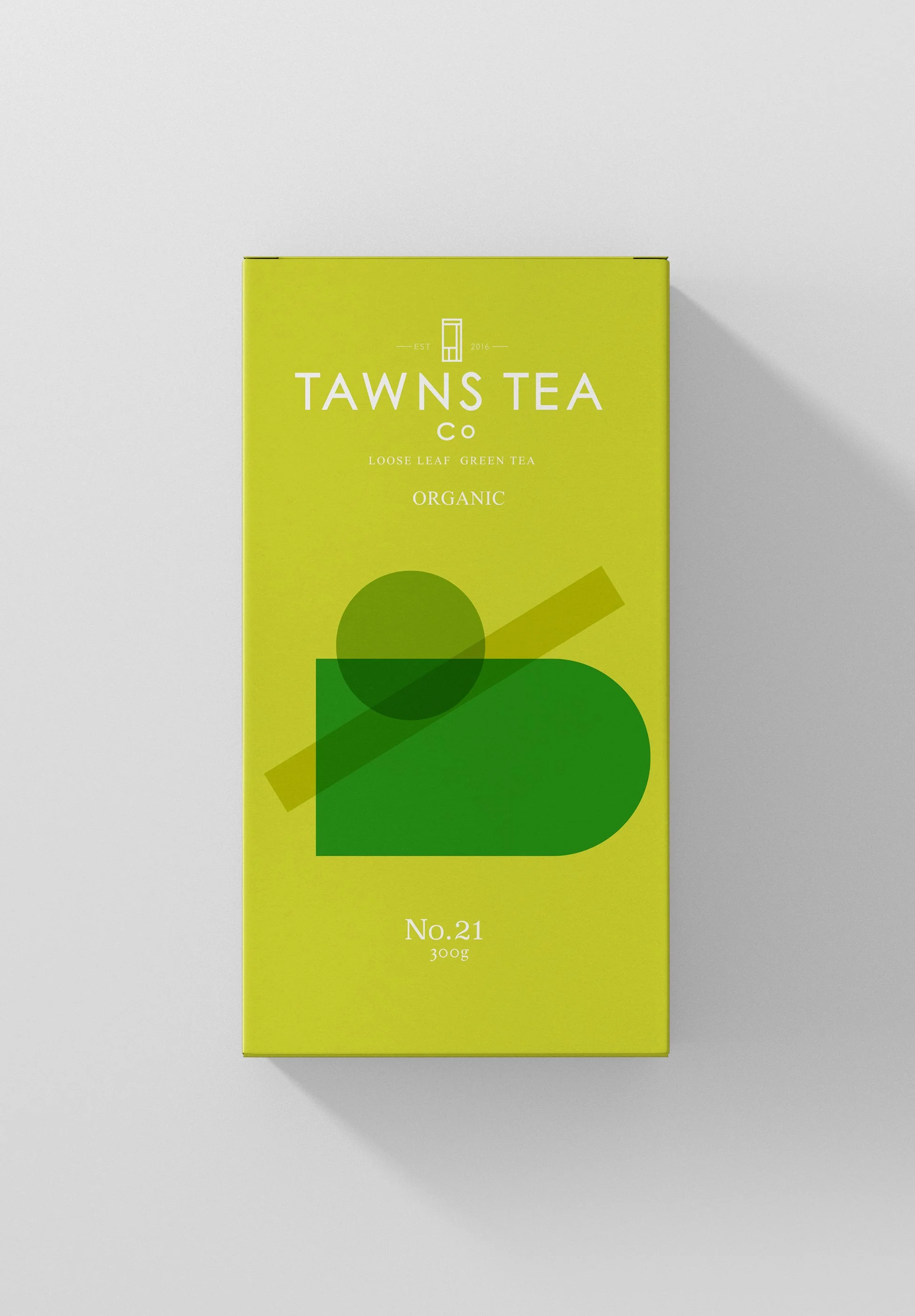
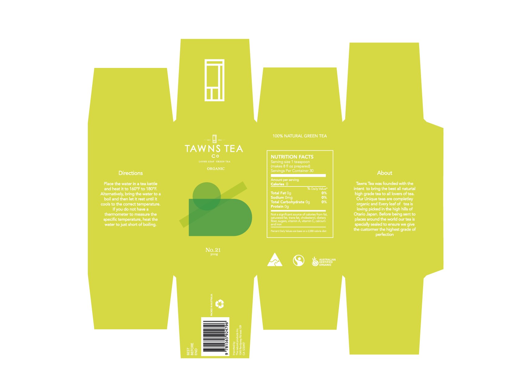
Before starting my studies, I decided to challenge myself by creating a packaging project from scratch. I developed a concept for a premium green tea brand, designing a packaging system with a strong visual identity that could be expanded into a wider range.
I used a restrained colour palette, generous white space, and refined typography to create a calm and sophisticated aesthetic. While the geometric shapes appear simple, each was carefully designed to represent an element of the tea-making process, including the tea leaves, the container, and its handle. Together, they form a subtle visual identity that can be carried across the wider product range.